


- Orbital Insight Blog
- DRC Ebola Outbreak: Land Use Data Made Available for Emergency Responders
Blog
DRC Ebola Outbreak: Land Use Data Made Available for Emergency Responders
Overview: Ebola Crisis in DRC
The latest Ebola crisis in the Democratic Republic of Congo (DRC) was recently declared by Doctors Without Borders to be the worst ever documented in that country, and the second-largest Ebola outbreak recorded anywhere. The World Health Organization believes it to be a public health emergency of international concern. In particular, the epicenter of the Ebola outbreak is in North Kivu, a densely populated area in the country’s northeast that also shares a border with Uganda. As the number of new confirmed Ebola cases continues to grow, violence and political unrest in the affected areas have further restricted the community’s access to health care. Security constraints are hindering the Ebola response, making it difficult to identify new cases, trace contacts, and conduct vital community outreach activities.
To support local and international efforts in containing and treating this disease outbreak, Orbital Insight is offering a sizable amount of updated foundation mapping data based on Artificial Intelligence analysis of Airbus SPOT satellite imagery. This data release was entirely derived through the Orbital Insight GO Platform, using custom-built in-house algorithms and a direct pipeline with Airbus, and has the following key features:
- Includes five usable feature types at 1.5 meters resolution, depicting Human Infrastructure (buildings and roads) and Natural Area Features (forest, grassland/agriculture, and water).
- Covers five ADM2 provinces within North Kivu — Goma Town, Masisi Territory, Nyiragongo Territory, Rutshuru Territory, and Rutshuru Town — over a total area of more than 12,000 square kilometers. This region is depicted in Figure 1, below.
- Derived from imagery dating between July 2018 and July 2019, and entirely via an automated pipeline and output; it is not hand-edited or otherwise manually curated in any way.
- The data is intended to support multiple use cases in crisis scenarios like these, as outlined below.
This algorithm and methodology is transferable to any other region, and at any large scale necessary, pending available imagery coverage.
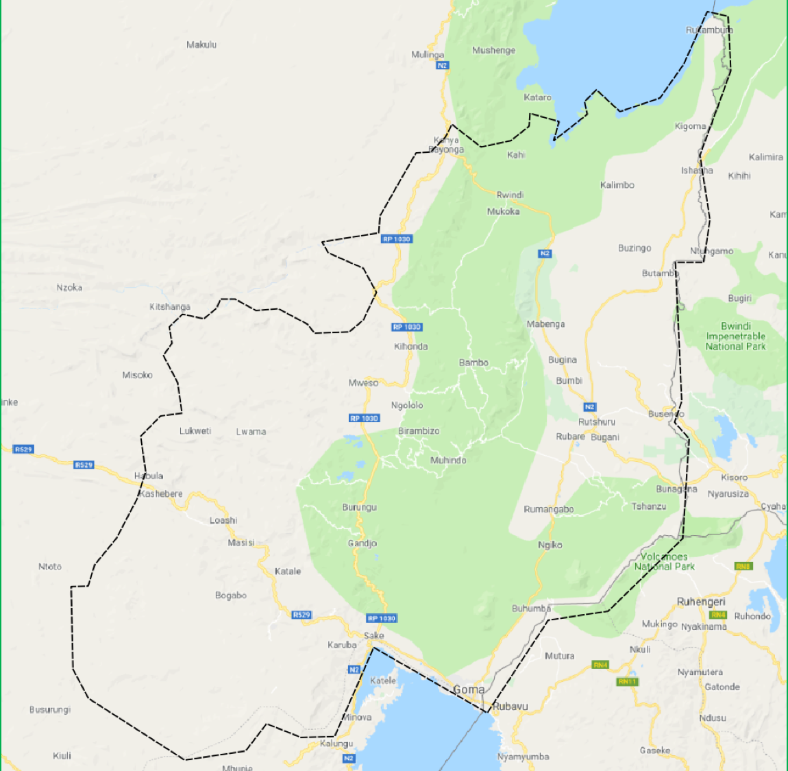
Figure 1: an overview of the region covered in this data release, noted by dashed-black outline displayed over a Google Maps background.
To access the data, please fill out the form.
How does Mapping Data Help?
Accurate and up to date mapping data — particularly on where populations are located, and the transportation networks/interconnectivity between them — is a crucial resource for containing such outbreaks. Such information can aid in understanding both the spread of transmission-based outbreaks, as well as coming up with effective mitigation strategies. Local and international health experts have synopsized this value proposition:
- Accurate location data communicates the reality on the ground to all levels of the health hierarchy, to effectively analyze the situation and allocate resources, as well as international partners who don’t know the country, let alone remote regions therein.
- Real and accurate data should be able to inform as to exactly where villages and populated infrastructure are, as well as different transportation routes and interconnectivity between them. All of this helps understand where the outbreak is, where/how it’s moving, and predict future risk.
However, it is very difficult to maintain accurate and up to date records across large, sparsely populated geographies. Official records in many of the world’s more remote and isolated communities are often out of date, geographically misplaced, or otherwise incomplete. The below excerpt underscores the current state of affairs in DRC and difficulties therein.
Research and Analysis Excerpt from The Atlantic
But the Congo is a massive country — a quarter the size of the United States with considerably fewer resources. Until very recently, they haven’t had the resources to get accurate geolocalized data. Instead, the boundaries of the health zones and their constituent “health areas,” as well as the position of specific villages, towns, rivers, hospitals, clinics, and other landmarks, are often based on local knowledge and hand-drawn maps…
Much of the Congo is also incredibly remote, and many villages have never been included on a digital map. Some were added based on information from the last census, which was done in 1984, using data points that often weren’t actually collected on the ground…
There still isn’t an accurate map showing where all the [Ebola] cases are coming from.”
Excerpt from Most Maps of the New Ebola Outbreak Are Wrong
The combination of Artificial Intelligence and commercial imagery can help significantly with this mapping challenge. Orbital Insight is pleased to leverage our capabilities and partnerships to do so, offering an up to date mapping data release for a large portion of the DRC’s North Kivu province. The speed and accuracy of this methodology compares favorably to open mapping campaigns, which take hundreds of human work hours, and is intended to support or work iteratively with human-in-the-loop process (see our other recent publication on some ways we do this).
Orbital Insight / Airbus Data Release
North Kivu Data — Orbital Insight Land Use Algorithms on Airbus SPOT Imagery
Orbital Insight’s highly trained AI feature recognition algorithms allow us to run and detect key infrastructure and area characteristics on a large scale, for any part of the world. We leverage multiple satellite constellations with Earth-imaging capabilities and build bespoke algorithms for feature recognition and detection off of each one. Orbital Insight has a very strong partnership with Airbus Defense and Space and together were able to produce this data. Airbus supplied the imagery and Orbital Insight provided the analytics. These results have been generated free of charge from both Airbus and Orbital Insight.
This particular data set was created using Orbital Insight’s newest Land Use classification algorithms, leveraging the Airbus SPOT constellation which images the earth at 1.5m pixel resolution. The Orbital Insight GO Platform was able to ingest several hundred SPOT images and scan large volumes of pixels very quickly to identify Land Use features. We are making this data available to help GIS analysts and international policy decision-makers including first responders, NGOs, and public health officials.
To access this data, please fill out the form. Metadata and context are provided in the following section.
Feature Classes, Examples and Algorithm Tuning
The following data layers are included in this release: Buildings (polygon), Roads (linestring), Forest (polygon), Grass/Agriculture (polygon), Water (polygon).
There is an additional data layer showing which portions of the region were not available, or were otherwise invalid for Land Use analysis.
- While Airbus SPOT did cover the entire region, there were portions that were more cloudy and/or less frequently imaged; we were not able to extract any features in these areas and have classified them as such.
- Users are advised to be mindful that the absence of data in these regions does not mean there are not features there, it simply means there was not sufficiently usable imagery to provide interpretation in this case.
We are also including an outline of the overall area analyzed, which covers the five ADM2 boundaries discussed above (some results may extend beyond these immediate boundaries if they are in a shared “tile” with features inside the boundary).
Examples — Buildings and Roads
Several examples below show areas where we detected populated infrastructure in a value-added capacity.
- Open-source data is often outdated, leaving a critical knowledge gap when delivering assistance to populations in need. This is particularly the case when they are based on infrequently collected foundation sources, and/or manual curation.
- Using the most up to date commercial satellite imagery mitigates the former issue, and can also be applied to validation efforts. However, manually scanning large quantities of imagery can take a long time and is not efficient for covering large areas, or ensuring proper prioritization of resourcing for more intensive updates. This is the case with widely used open sources like Open Street Map (OSM).
- Industry data sets that do not exclusively leverage the latest satellite imagery also suffer from the same challenges. Google Maps is a widely used and generally well-populated industry standard, yet is dependent on third party efforts and ground collection.
The examples in Figures 2–6 offer comparisons of these existing sources with the data we generated through our partnerships and technology. Our data is shown exactly as our automated processes provided it, using only AI and data science algorithms to extract interpretable, structured datasets from satellite imagery; they have not been hand-curated or edited/manipulated in any way.
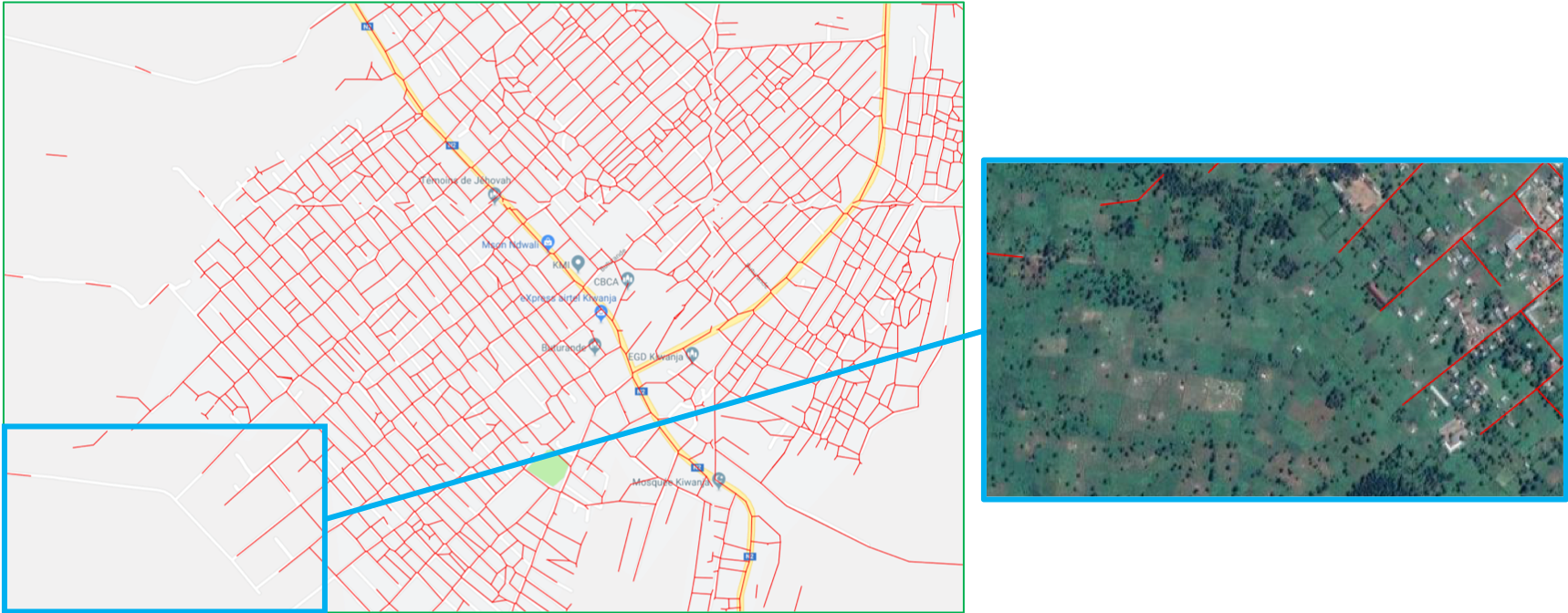
Figure 2: The main frame of this example shows our road detections (red lines) matching up very well with Google Maps Streets in one of the areas it has data. In fact, we have also managed to find a suggested update, as the inset shows there are no roads where Google still has them marked (in other words, we were correct in not detecting road segments in that portion).
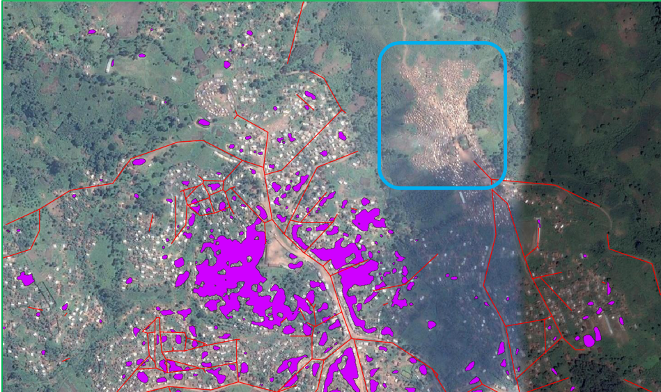
Figure 3a: this graphic shows our road (red) and building (purple) detections in a very remote, isolated town. They are displayed over older reference imagery, which shows that we generally detected the presence or absence of infrastructure correctly even in a very remote, forested area. However, the blue bounding box shows infrastructure we did not detect.
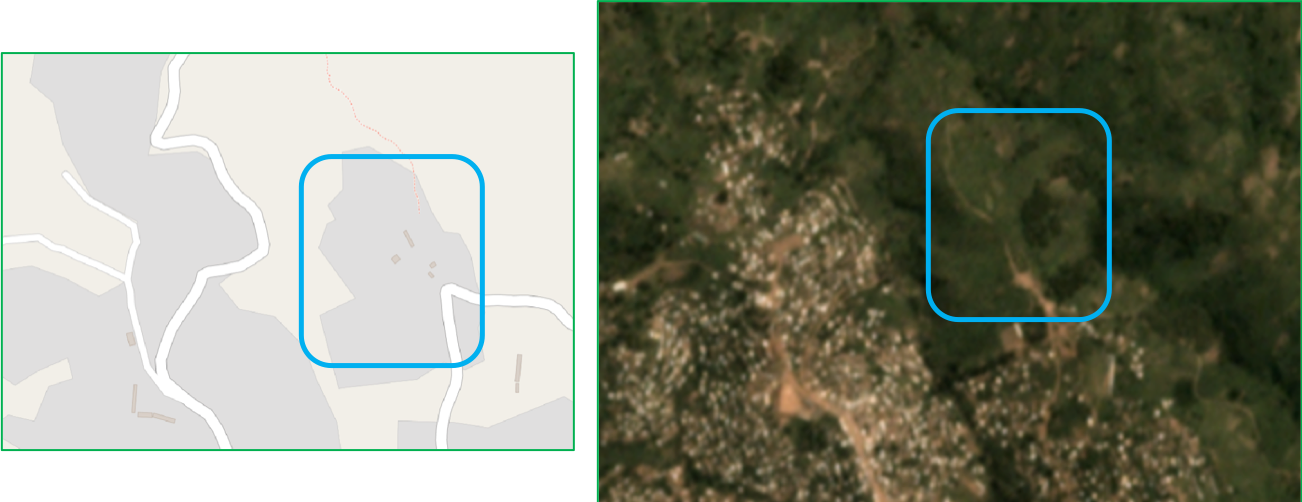
Figure 3b: This graphic shows a more in-depth exploration of that potentially missed detection from Figure 3a. OSM (left) also has infrastructure marked at that location. However, a recent lower-resolution image (Planet Mosaic, July 2019) shows that there is no infrastructure there anymore (right). Thus we have validated both the performance of our algorithm and also its value relative to open source alternatives.
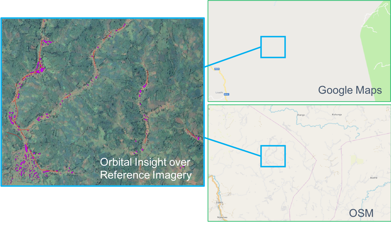
Figure 4: Here is an area that is completely unmapped by Google (upper-right). OSM mappers have spent some time digitizing the area’s population centers (lower-right); we do not know the currency of their sources and this likely required substantial manual searching and digitization efforts. Our detected features (left/inset) can provide a starting point for such mapping campaigns as well as confirm populated areas and transportation networks that have already digitized; they can generally help resolve inconsistencies between the two other datasets, validate their currency, and/or help prioritize their next rounds of updates.
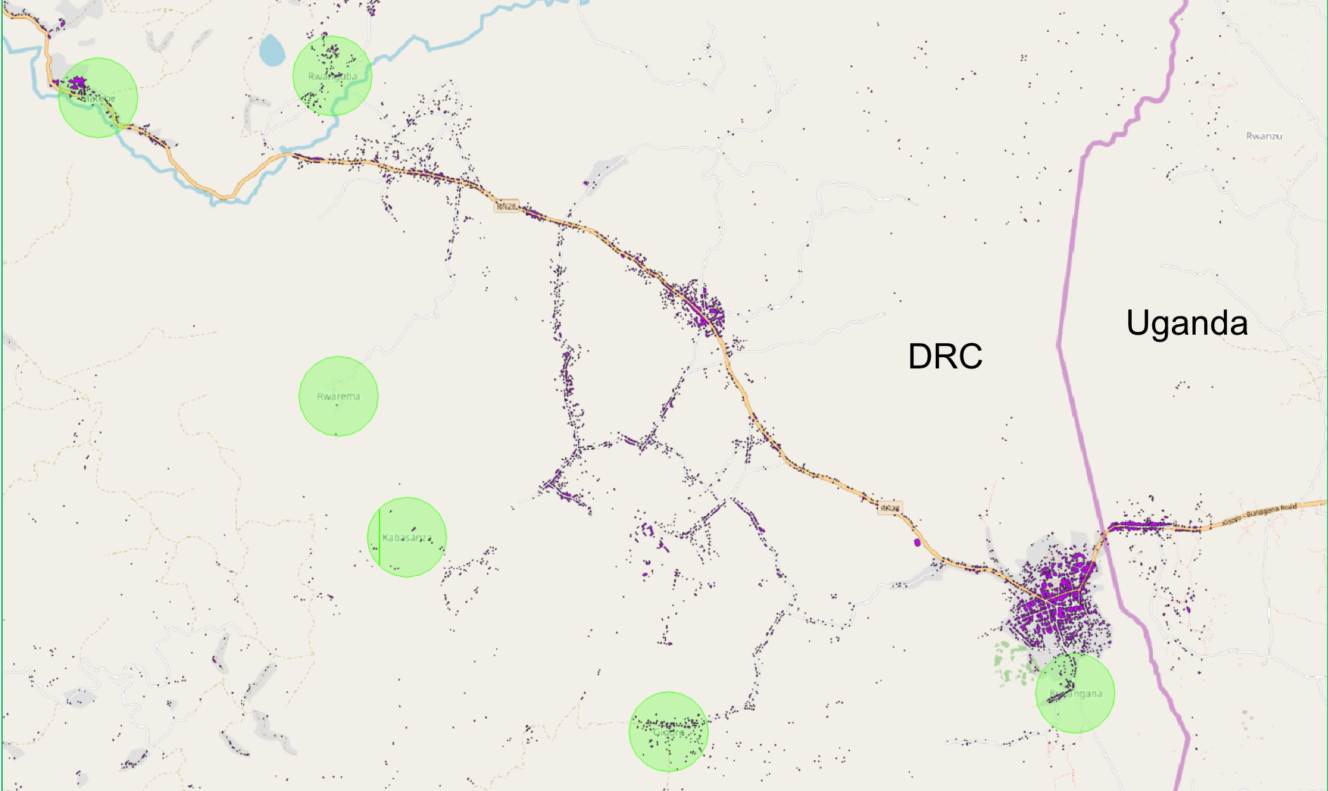
Figure 5: Here is one more OSM comparison, in the region bordering Uganda. We see that OSM-marked populated places (green circles) are sometimes mismatched from where we have detected populated infrastructure (buildings in purple). These are either geographically misplaced, or else we have detected settlements that are not marked by OSM. Either way, we hope this can help validate and fine tune existing data records.
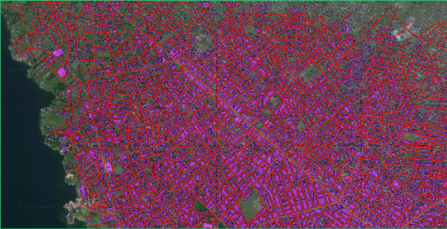
Figure 6: Finally, here is an example of buildings and roads in the northwestern portion of Goma. Given our choice to err on the side of recall vs precision (more details below), we do not get as many individual small building outlines in this denser urban area; yet, we do find this a generally accurate and replete depiction of infrastructure.
Feature Detection Optimization
We are able to customize the parameters we use to reformat raw computer vision results into interpretable, well-formatted data sets that humans can work with. This lets us find an optimal balance between precision (“did we classify a feature correctly?”) and recall (“how many of what’s actually there did we classify correctly?”).
- For Human Infrastructure: we chose to test various thresholds and iterate towards a higher recall for Buildings and Roads classes, so as to capture more data for human population, infrastructure and connectivity in remote regions. This comes at a cost of potentially more false positives and slightly lower individual feature fidelity in densely populated areas; however, this tradeoff was warranted given that our goal is to map the unknown, rather than provide more data only on already well-mapped regions.
- For Natural Area Features: we chose a more balanced threshold for Forests, Grass/Agriculture, and Water classes. We likely will not capture every one of these features across the entirety of the region, or see the extent of some classes (for example, small rivers or inland bodies of water), but also will likely have very few false positives.
Additional Information
Project Timeline
The work breakdown and approximate timing to obtain these results are as follows:
- Define area of interest — research outbreak, download ADM boundaries, select suitably sized region (0.5 hrs)
- Set up project in Orbital Insight’s GO Platform — using selected region, choose algorithm and date range, iterate until sufficient coverage is found (0.5 hrs)
- Project runs in GO — imagery ingested from Airbus, computer vision algorithms applied to it (2 days / 48 hrs)
Orbital Insight’s Artificial Intelligence
Orbital Insight computer vision algorithms are trained individually on different sources of satellite imagery. In this case, we have leveraged our SPOT imagery algorithm to detect relevant land-use area features. Our algorithms and the sources they utilize are available and performant on a global basis. Through the GO Platform, projects like these take a matter of hours to complete, comparing favorably to what it would take human analysts to search a similar scale of imagery and catalog multiple classes results at this fidelity (on the order of weeks, and/or disrupting their regular responsibilities).
Airbus Partnership and SPOT Imagery Advantage
Commercial imagery sources like SPOT, and the analytics we derive from them, offer over 10x the resolution (100x as many pixels) compared to the most competitive freeware / open-source alternatives. This allows us to detect increasingly finite features and details, and confidently distinguish across a wider variety of semantic land use classes.
Meanwhile, the robust coverage of SPOT imagery means we can simultaneously offer relative advantages in currency, cadence, and reachback potential compared to ultra high-resolution imaging platforms; these include some with up to 2–3x the resolution of SPOT, but they are rarely tasked over remote, wide areas like those we analyzed here. Consequently, we can guarantee more frequently up-to-date information, as well as across more frequent intervals to enable long-term analytics in both retrospective and forward-looking capacities.
Sources Referenced
“Democratic Republic of Congo: Ebola Virus Disease — External Situation Report 51 — Democratic Republic of the Congo.” ReliefWeb, World Health Organization, 23 July 2019, reliefweb.int/report/democratic-republic-congo/democratic-republic-congo-ebola-virus-disease-external-situation-66.
“Ebola Outbreak in Democratic Republic of Congo.” Doctors Without Borders, 2019, www.doctorswithoutborders.org/ebola-outbreak-democratic-republic-congo.
Howard, Jacqueline, and David McKenzie. “Ebola Outbreak in Congo Is a Public Health Emergency of International Concern, WHO Says.” CNN, Cable News Network, 18 July 2019, www.cnn.com/2019/07/17/health/ebola-outbreak-who-emergency-africa-bn/index.html.
Scavo, David, and Kunio Shimizu. “AI + Humans: How Artificial Intelligence Scales Human Expertise for Detecting Changes to the Earth.” Medium, Orbital Insight, 12 Aug. 2019, medium.com/@orbital_insight/ai-humans-how-artificial-intelligence-scales-human-expertise-for-detecting-changes-to-the-earth-8d40d4d8f9db.
Yong, Ed. “Most Maps of the New Ebola Outbreak Are Wrong.” The Atlantic, Atlantic Media Company, 21 May 2018, www.theatlantic.com/health/archive/2018/05/most-maps-of-the-new-ebola-outbreak-are-wrong/560777/.
To access the data, please fill out the form.
Recommended for You
-


Sep 18, 2019
Using GO to Observe the Operational Status of Suspected Chinese “re-education” Camps
Learn More -


-

Dec 19, 2018
Artificial Intelligence Helps Distinguish the Forests from the Trees (Part 2)
Learn More
Dec 11, 2018
Artificial Intelligence Helps Distinguish the Forests From the Trees (Part I)
Learn More